Culture
Who or What Is ‘Latino’? Héctor Tobar Considers a Term’s Many Meanings

Tobar’s students sometimes recast their traumatic histories as trials resembling those of mythic heroes from books, movies, manga and anime, imagining themselves as protagonists from the Marvel Universe, Naruto and “Star Wars.” To Tobar, this makes perfect sense. These popular epics, in which outcasts and everyday people rise up to defeat oppressive powers, resemble the quests and battles survived by his students’ families and ancestors, who have escaped villainous gangs and governments, traversed oceans and continents, and evaded the militarized barriers of the world’s most powerful nation.
“Stories about empire,” Tobar writes, “move us because they’re echoes of the memories that reside deep in our collective consciousness.” Latinos, after all, are people “living with the hurt caused by war and politics, conquest and surrender, revolution and dictatorship.”
For readers without Latin American heritage, Tobar takes care to depict Latino life in a universal light, as something easily comprehensible to anyone who has ever felt the pull of a far-off person or place: “To feel that your being, your happiness, your wholeness and your love are divided between two distant spots on the globe is an entirely normal condition in the modern world.” So many exoticized aspects of Latino experience, he argues, are in fact exceedingly common; they seem bewildering only because they are rarely articulated, unlike the “fairy-tale” notions of whiteness prevalent in our dominant culture.
Tobar does not discuss whether he believes “Latino” is a label worth keeping, or whether there is another term we might someday seek to replace it with. He avoids in large part the history of conflicting movements within the Latino community, and neglects to fully examine issues of intersectionality and colorism, or whose stories are favored over others and what it means to achieve “representation.” While Tobar’s book is too slim to satisfyingly encompass every complexity, he nevertheless succeeds in capturing a kaleidoscope of shared stories and circumstances, of feelings and preoccupations that are both buried and overt.
For those who, like me, exist somewhere on the spectrum of Latinidad, “Our Migrant Souls” is likely to be a resonant and deeply affecting book, one that often holds up a mirror to our lives. While reading it, I often thought of my grandfather, who came to the United States as a small child, carried across the border during the Mexican Revolution. As he and his siblings were subsumed into American life, they came to reject ties to Mexico that might “darken” them, clinging instead to a centuries-removed “Spanish” lineage.

Culture
MLB City Connect: All 29 uniforms ranked, from the so-so to the sublime

Editor’s note: This column has been updated to include the Los Angeles Dodgers’ second City Connect entry, which was introduced Monday afternoon.
When the Minnesota Twins took the field last Friday, they became the 28th team to debut their MLB City Connect uniforms, capping off the first round of Nike’s planned three-year cycle of city-inspired fits. (It will begin again this week as the Dodgers debut their second iteration.) The two teams not participating in this round were the New York Yankees, who don’t mess around with their classic look, and the Oakland Athletics, who are in a complicated situation with the city they are supposed to connect with.
Eight teams debuted new uniforms this season: the Twins, Cleveland Guardians, Detroit Tigers, New York Mets, Philadelphia Phillies, St. Louis Cardinals, Tampa Bay Rays and Toronto Blue Jays.
With each new uniform set introduced, many opinions have been espoused online and at the ballpark. All versions seem to have their detractors and defenders, stirring up purists and progressives alike.
It’s hard to find a consensus for something like this, but our panel — featuring MLB writers C. Trent Rosecrans, Tyler Kepner and Stephen J. Nesbitt and Culture writer Jason Jones — took the baton from last year’s cohort and made a case for its favorites, discussing the good, the bad and the ugly of the complete City Connect slate.
Our writers ranked each uniform using a scoring system of 1-30 (1 being the best), and those totals then were averaged and ranked. Here are their takes:
Joe Kelly. (Jayne Kamin-Oncea / USA Today)
The uniforms, in addition to showing love to the Hispanic community, celebrate Fernando Valenzuela and his outstanding rookie season in 1981, which resulted in a World Series championship.
On-field debut: Aug. 20, 2021
C. Trent Rosecrans (29): Just lazy. While I’m not an all-out hater of dark jerseys on dark pants, the switch to white pants from blue pants was an improvement. But the fact they needed to change it tells you all you need to know about how much effort was put into these.
Tyler Kepner (29): With all of Hollywood to use as a theme, slapping “Los Dodgers” on a blue jersey (over blue pants, no less) was almost aggressively dull.
Stephen J. Nesbitt (29): Odds are, if you go to a game at Dodger Stadium and sit at least 10 rows back, you’ll forget these are City Connects. It’s hard to miss them when they’re gone if you barely noticed them in the first place.
Jason Jones (16): I like “Los Dodgers” but as a Los Angeles native, “Los Doyers” would have been better. They’re not terrible, but not great. Kinda in the middle. More black on the jersey might have helped.
28. Detroit Tigers (24.75)

Tarik Skubal. (Junfu Han / USA Today)
An homage to the Motor City’s ingenuity, these unis feature several car-inspired details, including tire treads, VIN tags and road signs.
On-field debut: May 10, 2024
Rosecrans: (26): At least in other hype videos, they pretend to like the new uniforms, but in this one half the people are wearing regular Tigers gear and they rap about the Old English D, which only has a cameo on the uniform’s sleeve patch. The tire tracks look like the people wearing this have been run over, which may be an appropriate metaphor for the last decade or so of Tigers baseball, but it’s hardly inspiring.
We got next. #MotorCity pic.twitter.com/vhKEHgWeGw
— Detroit Tigers (@tigers) May 6, 2024
Kepner (27): This predictable “Motor City” theme is begging for the Jaws of Life. It’s yet another dark jersey over dark pants combo, with a cap that looks like a mid-level prize option at a carnival.
Nesbitt (27): In case the “Motor City” nickname didn’t get the theme across, you’ve got tire tracks down the placket (?), a VIN tag on the cap and helmet (??), and a sleeve patch designed like the M-1 road sign (???). We get it! Cars! It could have been worse, I guess. Shocked that the designers didn’t just slap “SOUTH DETROIT” across the chest while they were at it.
Jones (19): I’m fine with “Motor City” but it goes overboard with the car references. Who wants a jersey with tire marks?! Might as well have used a license plate for names on the back.

Connor Joe. (Charles LeClaire / USA Today)
Incorporating the colors of black and gold is a Pittsburgh sports thing. Also, notice in the shirt the asteroid, which references the city’s “steelmark” logo.
On-field debut: June 27, 2023
Nesbitt (25): These are bright and loud, but not novel. Going with black and yellow in a city where every team wears black and yellow is safe. That’s fine. But this franchise has a rich history of interesting and unusual uniforms from which inspiration could have been drawn.
Kepner (16): The yellow-over-black works really well; it’s the combo the Pirates wore in their last World Series victory, Game 7 in 1979 World Series. But “PGH” is just so lazy. Give us a new pirate, or go back to that rugged rapscallion from ’79.
Rosecrans (28): There’s no better example of being so close yet so far away than this thing. It’s much like the Braves in that it’s almost more of a throwback than a City Connect, but at least the Braves’ uniform looks good on its own. This does not.
Jones (29): I guess it’s illegal for teams from Pittsburgh to not wear black and yellow. The huge “PGH” feels like someone’s initials. These are too basic.
26. Philadelphia Phillies (23.5)

Bryson Stott. (Bill Streicher / USA Today)
Taking its palette from the city’s official flag, the blue-and-yellow kit incorporates some of Philly’s most famous historical iconography.
On-field debut: April 12, 2024
Nesbitt (23): These were billed as “unapologetically Philly.” Nothing says Philly like a font pulled from our founding fathers’ documents. Nothing says Philly like a disconcerting blue gradient. Nothing says Philly like a numeral style that makes Trea Turner’s number look like a question mark. So edgy. So historic. So unapologetically Philly.
Rosecrans (20): This is one where I think it’s important to see the uniform on the field. I defended this when it was announced and we saw the studio pictures. I was wrong. Seeing this on the field, it’s, well, a series of choices. The biggest difference between glamor shots and game action is just how utterly ridiculous the gradient from blue to black looks with the jersey going into the pants. The hat is elite, but it’s not enough to save everything beneath it.
Kepner (26): The stylish caps can’t save this hot mess. From the jagged wordmark to the bizarre numerals to the ridiculous color scheme, it’s a certified phiasco. According to the official press release, “Philly has always been a place unafraid to revolutionize, start anew and work hard to make change.” Maybe so, but it’s also a place that sees through pandering nonsense like this.
Jones (25): Nothing about these really makes me think “Philly.” I guess the Liberty Bell on the hat? Keep this uniform on Phillie Phanatic and I’m fine. It looks like a costume for the mascot.

Brett Wisely. (Sergio Estrada / USA Today)
The Golden Gate Bridge is on the sleeves of the jersey. There’s also a story with the fog gradient throughout the uniform.
On-field debut: July 9, 2021
Kepner (14): There was real potential here with the bridge-and-fog theme. It’s a clean look, but without another color, it seems unfinished. Subtle black accents would have punched it up.
Rosecrans (19): These have always looked incomplete to me. Still do.
Nesbitt (28): Devastatingly poor execution. Using fog as a gradient theme is, in theory, an inspired choice. But these come out looking awkward and cheap. The bridges look bad. The fonts of the “SF” and “G” logos clash. It all just looks like a big L.
Jones (27): Players look like containers of orange sherbet on the field. The bridge had real potential if these were designed knowing the A’s would be leaving Oakland after this season. Welp, it’s a swing and a miss.

Gunnar Henderson. (Tommy Gilligan / USA Today)
Basic black uniforms connecting with the city’s arts culture courtesy of mosaic designs. “You can’t clip these wings.”
On-field debut: May 26, 2023
Rosecrans (11): My initial reaction was that it was a bit generic, as if it should have a UPC sleeve patch, but it’s grown on me. It’s fine.
Kepner (21): It’s a boring jersey — the kaleidoscope of colors is mostly hidden on the inside collars and sleeves — but the set looks much better now that the team has switched from black pants to white. The “B” on the hat is sharp; they should use this style (rendered in orange), as their alternate insignia instead of “O’s,” with its upside-down apostrophe.
Nesbitt (26): At least the Reds tried. The Orioles’ all-black unis are readable, but the only interesting elements are the socks and the sleeve piping.
JUST IN: The @Orioles have revealed their City Connect uniforms pic.twitter.com/bVYP8U10RO
— MLB Life (@MLBLife) May 22, 2023
Jones (28): Yawn. The colorful parts are barely noticeable.

Jordan Wicks. (Matt Marton / USA Today)
In an attempt to unite Chicago’s 77 neighborhoods, “Wrigleyville” was born.
On-field debut: June 12, 2021
Kepner (19): I like how the “Wrigleyville” lettering mimics the famous marquee outside the ballpark. But those dark pants — ugh! They should ditch them for white pants with a stripe of green Wrigley ivy crawling up the side.
Rosecrans (23): I lump this one with the White Sox because they both look more like bad souvenir stand jerseys than actual uniforms. The use of the star from the Chicago flag inside the C on the cap is solid, but that can’t make up for the rest.
Nesbitt (21): For such a storied franchise, in an iconic stadium and a colorful city, this is remarkably unspectacular. If I were a Cubs fan going to a game and they were wearing this boring all-blue (yet not Cubbie blue) uni, I’d be bummed.
Jones (18): It’s not bad. It’s also not spectacular. I don’t hate it. But it doesn’t do much for me.
22. Minnesota Twins (20.0)

Jorge Alcala. (Matt Krohn / USA Today)
The blue and yellow color scheme and ripple pattern on the jersey pay tribute to the elements of the Land of 10,000 Lakes.
On-field debut: June 14, 2024
Kepner (28): There’s so much they could have done to weave in the natural beauty of a Minnesota summer, but by plunging into the deep waters of a “ripple effect,” the whole thing drowns. As for the postal code “MN” wordmark, I’d stamp it: RETURN TO SENDER.
Rosecrans (21): This has big end-of-the-cycle energy, when all enthusiasm for a project is over and you just want to put something out so it’s done. While not terrible, it’s just … there. Here are a few suggestions I think could help:
- White pants.
- Remove “10,000 LAKES” from the side of the hat.
- Sleeve patch as primary logo.
Boom. You’re not getting an A if you make those changes, but you don’t have to worry about bringing down your final grade so far that it gets uneasy.
Nesbitt (16): Forgot how many lakes? It’s on the side of your cap, in 10,000-point font.
Jones (15): Fan of the details on the jersey, even though these could be mistaken as knock-off Seattle Mariners jerseys at a glance. A top-tier decision would have been to go with purple for Prince.

Justin Verlander. (Troy Taormina / USA Today)
Houston has a respected reputation for its space education. “Space City” has similar font as the NASA logo from the 1970s.
On-field debut: April 20, 2022
Kepner (20): Do people in Houston ever say they’re from “Space City”? Wouldn’t that name work better for a self-storage facility? I love the lettering and numerals, which evoke the NASA wordmark. But given the Astros’ history of innovation — like the glorious “Tequila Sunrise” jerseys of the 1970s-80s — they should have used something more whimsical than navy-over-navy.
Nesbitt (11): Each element of this City Connect uni is, on its own, quite agreeable. The yellow-to-orange gradient is everywhere from the cap to the socks. The NASA “worm” font is fun. The uni number on the pants is a nice throwback touch. But the dark blue background steals from all that goodness. If Nike reprints this as a white jersey, it would soar up these rankings.
Rosecrans (22): When Ronel Blanco was throwing his no-hitter, I was distracted by the way the placket fell between letters and looked like it said “SPACIE CITY.” I like elements of this one, but it’s just too much blue. Maybe using an orange hat, or at least an orange crown with a blue bill would break up all the blue a little.
Jones (20): The colors are great. Space City? I could do without that. How about “H-Town” on the front? The “H” on the hat is the best part.
20. New York Mets (18.0)

Jose Quintana. (Brad Penner / USA Today)
An homage to all boroughs, these unis take inspiration from the people, bridges and transit that power the city.
On-field debut: April 27, 2024
Kepner (15): It’s better up close than in action, because the names and numbers are hard to read in the black-over-dark-gray style. I love the bridge on the hats and helmets, but they should have leaned into the purple a little more, especially for the cap emblem.
Rosecrans (13): They look better on the field — the purple accents are great — but the helmet alone bumps up their ranking. While I don’t like the bridge motif on the hat, I love it on the batting helmet. The best part is the subway map in the lining of the hat. As is the case with too many of the City Connects, the best parts are hidden from view.
Nesbitt (22): Why go with “NYC” across the chest? “Queens” is right there. It’s only faintly Metsy. And it’s a flop, for me.
In our City Connect era. #IYKNYYKhttps://t.co/dJI9OgVfSA pic.twitter.com/4YUeZb6Yic
— New York Mets (@Mets) April 19, 2024
Jones (22): The “NYC” style lettering and colors remind me of a Negro Leagues jersey. Feels like this was a missed opportunity not going with “Queens” and leaning more into the purple accents. More Queensbridge could have led to a great partnership with rap legend Nas.
19. Toronto Blue Jays (17.75)

Tim Mayza. (Dan Hamilton / USA Today)
These ‘Night Mode’ themed uniforms feature vibrant colors meant to reflect Toronto’s energetic nightlife and illuminated skyline.
On-field debut: May 31, 2024
Kepner (24): White outlines could have accentuated the fun skyline motif, but without them, we’re left with an illegible blur from more than a few feet away. And have I mentioned that black jersey/black pants is a tired act?
Rosecrans (16): The evolution of my reaction to this one:
Hat leaks: So good! This could be the best one yet!
Jersey leaks: So bad! This could be the worst one yet!
Official release: Oh yeah, not good.
On-field debut: Better than expected.
Nesbitt (19): Cool colors. Entirely illegible. Rinse, repeat.
Jones (12): I really like the design. It probably would have worked better against a white, gray or light blue backdrop, but I still like it. Maybe it is just because I really like Toronto as a city and seeing the skyline makes me happy.

Jesús Tinoco. (Jim Cowsert / USA Today)
The uniform is a nod to Texas’ independence day. The jersey also features a peagle, a mythical creature blended from the minor-league logos of the Dallas Eagles and Fort Worth Cats (originally called the Panthers).
On-field debut: April 21, 2023
Kepner (12): The hat is a jumbled mess, and the number “0” looks weird, but this set does have an 1800s-Texas kind of vibe; you could picture a cowboy wearing it as he struts through the double doors of a saloon. Also, they created an animal! It’s a panther-eagle mix called a peagle. I’m all in on the peagle.
Rosecrans (10): I think this uniform is similar to my feelings about the movie “Talladega Nights” — the parts are better than the whole. You can tell a team is onto something when the merchandise associated with the uniform is more successful than the uniform itself. If the peagle hoodie were black instead of navy, I’d already own it.
Nesbitt (24): When the headliner of your City Connect is the mythical creature you created for a sleeve patch, and the warm-up act is a lid with a hilariously oversized “TX,” you’ve swung and missed.
Jones (24): Looks like the jersey was meant to be worn with Wrangler jeans and an oversized belt buckle. Don’t get me started on the peagle. It just confuses me.

Justin Martinez. (Joe Camporeale / USA Today)
“El Camino de las Serpientes”: The way of the serpent. These uniforms show love to the Sonoran Desert and Arizona’s Hispanic culture.
On-field debut: June 18, 2021
Nesbitt (20): The “Serpientes” script is nice. Really nice. But there’s a missed opportunity for a snake logo on the cap, and overall the uniform is overwhelmed by the desert-sand backdrop.
Rosecrans (18): There are maybe five people on Earth who remember the movie “Megaforce,” but it was some weird early-80s paramilitary fantasy movie that featured some weird desert camouflage and everything was that sand color. This reminds me of what Megaforce’s softball uniforms would look like. That’s not a compliment.
Kepner (25): I can see what they’re going for with the sand color scheme, but they take it too far when they use it for the pants, too. Credit, at least, for using the Spanish word for “snakes” rather than the lazy “Los _______” format we often see in MLB and the NBA.
Jones (7): “Serpientes” on the jersey is one of the best things in the City Connect series. Especially with a snake used to spell out the word. It also leans into the Hispanic culture of the region, and the gold jersey is different.
16. St. Louis Cardinals (16.75)

Dylan Carlson. (Jeff Curry / USA Today)
A more traditional and understated take on a City Connect, save for the center-stage homage to St. Louis’ favorite son, Nelly.
On-field debut: May 25, 2024
Nesbitt (18): Having studied all 28 designs, I’ve come to appreciate a safe approach. This looks like a Cardinals jersey. It’s not better than what they already have, but not atrocious, either.
Kepner (18): What a shame they didn’t perch the birds on the Gateway Arch, as designer Cameron Guzzo suggested on Instagram. And while the younger demographic in St. Louis might use the phrase “The Lou,” to everyone else, it means “the bathroom.”
Rosecrans (27): Milquetoast and uninspired. It’s a spring training jersey and an airport souvenir stand hat.
Jones (4): Nelly’s music introduced me to St. Louis culture in the early 2000s. He said, “I’m from The Lou and I’m proud!” So just like “The A” for Atlanta, this Cardinals jersey resonates. This isn’t overly creative, and I’m fine with it.
What can I say? City nicknames on City Connect jerseys work for me — except for Space City.

William Contreras. (Benny Sieu / USA Today)
“Brew Crew” always has been a team nickname. MKE is the abbreviation for Milwaukee’s international airport. Look closely and notice the city’s area code within the MKE.
On-field debut: June 24, 2022
Nesbitt (12): I like these! The grill is genuinely great. The caps are a bit of a bother. I once came home from Milwaukee with a free Brewers T–shirt that had “MKE” across the chest. No one knew what it meant. Stop trying to make airport codes happen.
Kepner (13): The MKE/414 mashup and the pointy wordmark don’t do it for me. I’d have preferred an all-out, gut-busting tribute to sausage varieties. Nothing goes better with brew.
Rosecrans (24): I’ve always hated “Brew Crew” as a nickname, but it’s even worse seeing it here. The airport code/area code hat logo is just too forced and jumbled. This one would jump about five places if the hat used the same grill logo that’s on the sleeve.
Jones (11): Brew Crew is one of the more fun nicknames in baseball (I know Rosecrans disagrees). The “MKE” on the hat isn’t my favorite, but the colors are vibrant and different enough from the usual Brewers look for me.
14. Cincinnati Reds (14.75)

Alexis Diaz. (Katie Stratman / USA Today)
Cincinnati’s uniforms represent a modern-day visual of the city. Looking to the past is the opposite of what they tried to do here.
On-field debut: May 19, 2023
Rosecrans (2): Yep, I’m going full-on homer with this one. I was skeptical when I first heard that the Reds’ City Connect was going to be all black, in part because I hate the black drop shadows on the Reds’ regular uniforms … but man, it’s been a breath of fresh air, even for a team that wore 29 uniform combinations in one season.
Nesbitt (17): The all-black look is fabulous in studio lighting or framed on your wall. But designers need to take pains to make an all-black uniform work in games, and this doesn’t pass that test. The “CINCY” and number font are unreadable.
Kepner (23): Black hats, black jersey, black pants — lighten up, guys! The new logo is a nifty, modern twist on the classic wishbone-C, but the whole thing is just too dark.
Jones (17): The cap is cool, but the more I look at it, the more the uniform reminds me of something I’d create in a video game.
13. Tampa Bay Rays (14.25)

Yandy Diaz. (Mady Mertens / USA Today)
A skateboard-influenced design meant to evoke the counterculture energy of the team’s home.
On-field debut: May 3, 2024
Rosecrans (3): I ordered my hat the day it was announced. I absolutely love it. The green accents are fantastic and I think if the numbers were that same color and more visible, this might take the top spot. The hat logo is the best the Rays have ever had and it should exist well beyond the three-year cycle.
That City Connect glow though >>>>> pic.twitter.com/rlho1KH8fF
— Tampa Bay Rays (@RaysBaseball) June 15, 2024
Kepner (22): Using black letters and black numbers on black jerseys makes no sense. Paired predictably with black pants, the whole thing just looks like a black void from a distance, like a Spinal Tap album cover. And yes, I understand that referencing a 40-year-old movie proves the point that these unis are made for a younger generation.
Nesbitt (9): Stitch for stitch, this is one of the coolest designs yet, with a dope logo, a cap tip to skateboard culture and neon flourishes all over. Worn best when players are decked out in colorful belts, sleeves and high socks. Without those, the look loses much of its sizzle.
Jones (23): I feel the glow with this one. I don’t mean that in a good way. Reminds me way too much of the New Orleans Pelicans’ fusion of black and neon this season, which I was not too fond of either.
12. Los Angeles Dodgers II (13.25)

Freddie Freeman. (Courtesy of Jon SooHoo / Los Angeles Dodgers)
A second wave of City Connect Dodgers uniforms pays homage to the city and its ties to the organization since moving from Brooklyn, N.Y., in 1958 — including the front workmark and the number typefaces.
On-field debut date: June 22, 2024
Rosecrans (25): What do you get when you combine the branding of Disney and Pop Tarts? Well, the new Dodgers Brand Connect! But hey, at least they didn’t make it “The Doyers.”
Kepner (8): You gotta love the nonsensical “storytelling” that accompanies each of these uniforms. The Dodgers say their front typeface has an “upward trajectory (that) speaks to the city’s pursuit of what’s above and beyond.” Also, that upward trajectory looks exactly like the DirecTV typeface. The uniforms feature a “galaxy of stars,” we’re told, which represent “the brilliance and diversity of Los Angeles.” Also, they look like sprinkles on an ice cream cone. Laughable explanations aside, I actually really like this one, as City Connects go. As a one-off, the name-under-number style on the back is kind of fun, and the Dodgers still look like the Dodgers, which is more than most teams can say.
It’s all in the details. 💫 pic.twitter.com/w9OT1zBzKV
— Los Angeles Dodgers (@Dodgers) June 17, 2024
Nesbitt (15): For a second effort, it’s not a home run. But the sprinkles look should at least sell well at the team store, and the cap logo, name-on-back positioning and color scheme are all moderately interesting elements.
Jones (5): This is a much better effort. Love the blend of the old and the new. The blending of the “LA” and “D” is nice. The look feels very Hollywood and futuristic. It’s baseball meets “Star Trek.” The hat is the best part, but I like the overall look.

Kenley Jansen. (Bob DeChiara / USA Today)
Going against the grain — no red — Boston pays homage to Patriots’ Day, as well as the Boston Marathon.
On-field debut: April 17, 2021
Rosecrans (8): You know the theory about how your first pizza will always be your ideal pizza? This is kind of like that — it was the first City Connect and as such, it’s what I think of when I think of the City Connect. That said, I still actually like it. While it’s a huge departure, it makes sense with so many of the Patriots’ Day touches and the marathon. I like that it’s completely different and is more about the city than the ballclub.
Kepner (17): Yes, these are the colors of the Boston Marathon. So maybe do it as a one-off on Patriots’ Day. Any more than that, and it’s out of step for a city and ballpark with many more sources of inspiration.
Nesbitt (14): As a two-time Boston Marathon attendee (not to brag), I think this is a cool idea and unique look. But there’s so much history in Boston — and so much Red Sox uni history — that I think if designers took another crack at this, they’d come up with something more evergreen.
Jones (13): No red on a Red Sox jersey is bold. I’m sure there’s a UCLA alum somewhere with this cap who doesn’t care that it represents Boston or has anything to do with the Boston Marathon.

Hunter Renfroe. (Jay Biggerstaff / USA Today)
Dark blue meshing with light blue. It’s a tip of the cap to why it’s called the “City of Fountains.”
On-field debut: April 30, 2022
Kepner (10): A rare conservative offering with the KC emblem patterned on the city flag and rendered like a fountain. And this has my favorite unseen element: “HEY HEY HEY HEY” on the inside collar, in tribute to the Beatles’ Little Richard cover that plays after every home win.
Nesbitt (13): This one doesn’t demand deep analysis. The fountain-inspired logo is neat, but the overall look doesn’t sing. It’s all right, but tame for an alternate. Nothing grabs your attention.
Rosecrans (17): Nez is right.
Jones (10): I’m a big fan of the color scheme. Give me all shades of blue.
9. Cleveland Guardians (12.25)

José Ramírez. (Ken Blaze / USA Today)
The classic color scheme, textured pattern and Art Deco influences are a nod to Cleveland’s famous Guardians of Traffic.
On-field debut: May 17, 2024
Kepner (1): I’ve felt all along that the Guardians should do more with the actual “guardians” — the bridge statue figures near the ballpark — to help folks embrace the 2021 rebrand. It’s hard to rally around a “flying G” insignia, after all, and this set includes a new logo that should become permanent. As for the uniform itself, the racing stripes are a welcome callback to the “Major League” era, the art deco font is classy, and I love how they weave little home plates into the CLE lettering.
Rosecrans (14): One of the things I’ve liked about the City Connects is trying to get away from the tired red, white and blue color scheme that is too prominent in baseball. Cleveland had a chance to do something new when they renamed themselves but just did the same old, same old.
Nesbitt (8): The more I see this one in action, the better it is. Each element is distinct and in agreement with the rest of the design. No one’s asking for the organization to lean harder into the “Guardians of Traffic” bridge pillars, but I’m digging the Art Deco font and the 1990s vibes.
Jones (26): I imagine it’s not easy figuring out what to do with the Guardians’ name because there isn’t much history with it yet. They tried, but ultimately these feel like the pants from the movie “Major League” and a jersey that’s still in the works.
8. Chicago White Sox (8.75)

Jared Shuster. (Kamil Krzaczynski / USA Today)
Dark gray, white pinstripes and gothic font prove to be a winner. Notice the “Chi” — also in gothic lettering — where “Sox” normally is on the cap.
On-field debut: June 5, 2021
Kepner (9): The White Sox claimed black-and-white as their color scheme in late 1990, and they’ve owned that look ever since, setting a trend that far too many teams have clumsily tried to imitate. I’ll make one exception for dark-jersey-over-dark-pants, and this is it.
Nesbitt (10): It’s very White Sox. If you like that, great. If you don’t, you still probably find this design inoffensive.
Rosecrans (15): I get why they did it and why some people like it, but it looks like a knock-off White Sox jersey you’d find on a clearance rack. And the hat? Huge downgrade, even if it’s just the three letters. It seemed cool when they did it, but it hasn’t aged well.
Jones (1): The black White Sox jerseys have long been a favorite. My affinity goes back to Snoop Dogg wearing a team jacket in the “Deep Cover” video in 1992, followed by Dr. Dre wearing the cap in the “Nuthin But A G Thang” video. I’m not from Southside Chicago, but if I was, I’d proudly wear this jersey to the ballpark.

Kevin Pillar. (Kiyoshi Mio / USA Today)
There’s a California beach theme within these uniforms. The left sleeve has asymmetrical stripes that remind some of retro surfboards.
On-field debut: June 11, 2022
Kepner (3): This feels straight out of SoCal in the ’60s, when the Angels arrived on the scene. The swirly, bubbly letters, the beach-blanket sleeve stripes — it looks like something you’d see on “Gidget.” Fun, fun, fun.
Nesbitt (4): Just delightful. It’s simple yet sharp, winking at the surf and skate culture while not completely throwing out the classic Angels look.
Rosecrans (6): You could’ve told me this was the team’s new everyday uniform and I’d just think they upgraded. It doesn’t feel City Connect-y enough but it’s hard to knock it for being just a good, solid baseball uniform. And hey, it’s better than the Dodgers, and how often can you say that about the Angels?
Jones (21): Feels very old-school in a way that doesn’t work for me. Could it be my Dodgers bias? Probably. I don’t like the Angels claiming Los Angeles from Orange County. Lean into Anaheim and the OC next time.
6. Seattle Mariners (7.5)

Luis Castillo. (Stephen Brashear / USA Today)
This uniform honors the city’s original MLB team, the Pilots, and it features Mount Rainier on the sleeve and a trident on the cap.
On-field debut: May 5, 2023
Nesbitt (1): There’s this line from a radio program I listened to as a kid: If you’re going to borrow, borrow from the best. That’s what the Mariners have done, bringing the Seattle Pilots back to life. For all the wildness, weirdness and wackiness of Seattle baseball, the Pilots got the look right. The trident logo. The chest font. The piping. Chef’s kiss.
Kepner (6): The jersey and hat are so sharp that the black pants (while horrible) don’t ruin it for me. The 1969 Pilots and the early Mariners teams didn’t win very much, but I’m always in favor of honoring a city’s baseball history. And I’m a sucker for the trident.
Rosecrans (9): I love the Pilots-inspired wordmark, but I don’t like the black, especially on the bill of the cap. There are very few caps I like where the bill is a different color than the crown and going from the blue to the black is jarring. There is just way too much black and blue together for me.
Jones (14): The cap is top-notch. It’s my favorite part of the uniform. The colors and font on the chest are all nice touches. And it’s a bit of a throwback. That’s big for someone who loves throwback jerseys and still wears them when relaxing.

Ha-Seong Kim. (Denis Poroy / USA Today)
A binational fan base is celebrated with these uniforms. Many of the team’s fans hail from San Diego, Tijuana, Mexico and Baja California.
On-field debut: July 8, 2022
Nesbitt (5): Wonderfully whimsical color scheme. Bravo. Pink and mint dominate the design. There’s yellow trim and name-on-back lettering, and most accessories seem to be yellow. It’s a lot. But it all works on the white uni. Different sleeve colors — who woulda thought!
Rosecrans (7): I’m not sure this would work anywhere else, but in San Diego it’s fantastic.
Kepner (11): Before they finally switched back to brown, the Padres’ uniforms had gotten so maddeningly boring that I can’t complain about their wacky City Connects. These uniforms are pretty silly, but they’re also lively and fun. Nothing wrong with that.
Jones (6): This is perfectly San Diego. That’s the best way to summarize this look.

Lane Thomas. (Geoff Burke / USA Today)
“Back in bloom”: The Nationals use a well-known signature of the city in their alternate uniforms.
On-field debut: April 9, 2022
Rosecrans (4): Pink is underutilized in sports uniforms. Gray has been overutilized, especially in the last decade. These two work in harmony on this gorgeous set. While I’m not a fan of airport codes (or what looks like airport codes) on uniforms, the rest is enough to make up for it. (If they’d just used “DC” on the breast, it’d be an easy No. 1 for me.)
Kepner (7): The cherry blossoms work perfectly here — distinctively D.C. and a new element to a baseball uniform. The pink-and-gray combo is a welcome contrast to Nike’s default dark, tough-guy costumes. Don’t love “WSH” though.
Nesbitt (7): Heartbreaking that this set is going away after the 2024 season. It’s a beauty.
Jones (8): I’m usually meh with gray uniforms. For some reason, I like the pink and gray combo. It’s a great combination for a suit-and-tie for church and works surprisingly well for the uniform.
3. Atlanta Braves (5.5)

Matt Olson. (Mady Mertens / USA Today)
Hank Aaron chasing his 715th home run in 1974 reminds many of this uniform. “The A” offers a look of nostalgia for older fans.
On-field debut: April 8, 2023
Kepner (5): You’ve gotta appreciate a uniform that honors Hank Aaron breaking the home run record in 1974. I’ve never cared for the lowercase “a” from those caps, so I love that they replace it here with the current “A.” Extremely well done.
Nesbitt (2): Most City Connects feel as if the design process began with outlawing anything remotely signature about the team’s current look. Not here. Crisp white unis with blue and red accents and hidden tributes to Hammerin’ Hank? Looks sublime. That’s all I care about here.
Rosecrans (12): So close to being good — the ’70s Braves uniforms are gorgeous. But there’s something about the unoriginality that makes me dislike it. But what I really dislike is the “The A.” I think there’s a difference between City Connects, throwbacks and alternates. This one is more throwback than City Connect.
Jones (3): Adding “The” next to the “A” puts this one over the top and makes it one of the best of the bunch. Almost all my friends say they are going to “The A” and not Atlanta. I know this is a tribute to Hank Aaron, but “The A” gives it just the right amount of modern flavor.

Josh Bell. (Rhona Wise / USA Today)
The uniform is a slightly modified tribute to the Cuban Sugar Kings, a Triple-A team that won a championship in 1959.
On-field debut: May 21, 2021
Rosecrans (1): Wonderful. No notes. Better than what they normally wear and anything they’ve worn before. The story makes it even better.
Kepner (4): It’s the only red jersey I can think of with white pinstripes, so it pulls off the rare trick of being unique yet uncluttered. Love the crown on the cap.
Nesbitt (6): The crown logos are a nod to the Havana Sugar Kings, a Cuban team that was the Cincinnati Reds’ Triple-A affiliate from 1954 to 1960. It’s bold and it works. Miami, baby!
Jones (9): I’m a sucker for jerseys with heavy historical connections. The nod to the Havana Sugar Kings is a winner here. The colors are bold, as they should be when representing Miami.

Ryan Feltner. (Rhona Wise / USA Today)
The Rocky Mountains, a predominantly green appearance and the letter font have these uniforms looking similar to the state of Colorado’s license plate.
On-field debut: June 4, 2022
Kepner (2): It doesn’t try to do too much: it’s the Colorado license plate, with matching wordmark and mountain range — not Rockies colors, but richly evocative of the state. Bonus points for the clever flourish of a double-black diamond ski patch on the sleeve.
Nesbitt (3): I don’t want an alternate uniform that feels like it was drawn up by a dozen creatives in a conference room. I want one that feels like it came from the days when everyone sent in designs to the local newspaper, and a sixth grader would win with something garish and unreasonable and … perfect. That’s what this is. A beer-league softball uniform in the big leagues.
Rosecrans (5): The hat looks like it was made by Patagonia and that’s not necessarily a bad thing. I liked them better with the green pants, which is probably an unpopular opinion. Green is underused in baseball, so it’s nice to see it.
Jones (2): This is nothing like the traditional Rockies uniform. No black, gray or purple and that’s what makes this edition stand out. It’s distinctly Colorado from the cap on down. No complaints here.
(Illustration by Dan Goldfarb / The Athletic; photos by Megan Briggs and Scott Kane / Getty Images, and Nic Antaya / MLB Photos)
Culture
You’ve Seen the Movie — Now Name the Book That Inspired It

Can you identify a book title just by looking at a photo from its film adaptation? (Or maybe if you had just a little hint?) That’s the challenge in this week’s installment of Great Adaptations, the Book Review’s regular multiple-choice quiz about books and stories that have gone on to find new life in the form of movies, television shows, theatrical productions and other formats.
Just tap or click your answers to the five questions below. And scroll down after you finish the last question for links to the books and their screen adaptations.
Culture
Jerry West, as a player and exec, sustained excellence during a lifetime of emotional struggle

The night his Los Angeles Lakers, finally, would return to their place of glory atop the NBA, Jerry West would not be in attendance.
“Oh, I won’t be there,” he told me on the phone, referring to what was then called Staples Center.
Wait, what?
The 1999-2000 Lakers, the team West had, at the cost of his nerves and health, put together for this very purpose, winning L.A.’s first hoops title in more than a decade, were a game away from conquering the Indiana Pacers in the finals. They would be coronated on their home floor. It would be the franchise’s first championship since 1988. It would be the culmination of West’s singular quest, having moved heaven and earth and most of the existing roster to get both Shaquille O’Neal and Kobe Bryant on the same team, and having swallowed his own pride to bring Phil Jackson in to coach. It would be marvelous.
And it would be done without West’s presence.
This wasn’t new for West. Such moments, now that he no longer could bring his prodigious talents to the court and impact winning games as a player, drove him to severe distraction. During Lakers home games, he would often drive around town instead. Sometimes, he’d check in to Chick Hearn’s mellifluous voice to see how things were going. That night, though, he kept the car stereo silent. He drove up the Ventura Freeway to Santa Barbara, a hundred miles north of the city.
“I told my friend Bobby Freedman only to call me if there was good news,” West wrote in his searing autobiography, “West by West.”
It wasn’t because he didn’t care, of course. It was because he cared so very, very much.
West’s death Wednesday at 86 caused more than one person around the league to choke up.
“It’s a very sad day,” said West’s contemporary and fellow Hall of Famer, Oscar Robertson, on the phone Wednesday afternoon.
West was, for decades, the personification of the sport. Few people’s counsel was more courted, so synonymous was he with the dogged, relentless pursuit of excellence. He was part of a dynasty as a player that couldn’t solve the Celtics, and then built dynasties as an executive that finally did. He was a 14-time All-Star and 12-time All-NBA selection. Two Lakers behemoths were built on his watch as the team’s general manager: the Magic Johnson-led squad that captured five titles in the 1980s, then the O’Neal-Bryant squads that laid down a three-peat between 2000 and 2003.
As Red Auerbach did for the Celtics, 3,000 miles east, West constantly was at the center of teardowns and rebirths of the Lakers. Decade after decade, the Lakers continued to matter in the NBA, riding Kareem Abdul-Jabbar and Magic and James Worthy through the ’80s, just as Boston continued to pile up the banners after the end of the Bill Russell Era, through John Havlicek, Jo Jo White and Dave Cowens in the 1970s, then Larry Bird, Kevin McHale, Robert Parish and Dennis Johnson. The Cs are currently hunting their 18th NBA title in their finals series this year with the Dallas Mavericks; the Lakers, their last title coming in the Orlando Bubble in 2020, are tied with the Celtics at 17.
I ranked Auerbach one and West two on my all-time list of NBA executives in 2017 for NBA.com. Nothing’s changed my mind in the intervening years. They were the ultimate architects, with Auerbach’s intimidating tactics and amazing motivational ability serving as the mechanical rabbit at a dog racing track, as West chased after the Celtics for a generation.
“I secretly liked and admire Red’s brazen ways, and he is one of the coaches I would have loved to compete for,” West wrote. “. … Red was the figure everyone loved to hate, and he didn’t mind it one bit. He didn’t mind being the villain. He would be anything you wanted him to be as long as it helped the Celtics win.”
But West doesn’t take a back seat to anyone when it comes to talent evaluation. He was the best ever. No former superstar as a player was in more gyms in more small towns and in more countries than West was, year after year, trying to find the next great talent. He didn’t get stuck in nostalgia; he still got excited about current players. He raved about Terance Mann when Mann was a little-known second-round pick playing for the Clippers in the Vegas Summer League in 2019.
He kept his own counsel about who, and what, he liked.
“It’s not so much trust,” he told me once. “I just think if you ask 10 people, you’re going to get more than one opinion. If you ask five people, you’re going to get more than one opinion. I’d rather not confuse myself by asking 10 people.”
Like Auerbach, West had eternal swag, the way Dr. J and Pat Riley and only a handful of aging luminaries still do. He was still in high demand after he left the Lakers in 2000, moving on to executive roles with the Memphis Grizzlies, Golden State Warriors and LA Clippers well into his 80s. It was West’s steadfast refusal to sign off on a proposed trade of Klay Thompson for Kevin Love in 2014 that kept Golden State’s ownership from pulling the trigger, and kept the Splash Brothers from being split up before they went on their franchise-changing championship run.
You still felt his crackling intensity in person, or on the phone. Well into middle age, I’d still get goose bumps when my phone would ring and the caller ID would identify who was on the other line. (He was “TLogo” in my contacts list, for obvious reasons.) He would always answer pleasantly: “David? Jerry West.”
As if it could have been someone else.
He was, given his pedigree, humble and deferential about his own successes. West was venerated for the 60-footer he hit at the end of regulation of Game 3 of the 1970 finals against New York to tie the game and send it into overtime. All West remembered, though, is that the Knicks won 111-108 in OT. He averaged an astounding 46.3 points per game in the Lakers’ Western Division series victory over Baltimore in 1965, which is still the record for highest average in a single postseason series.
He could be caustic and cutting about today’s players, the state of the game, David Stern and anyone else who didn’t measure up to his standards at a given moment. He could be withering about his own team. But if they weren’t winning doing it their way, he had very little patience for them. The portrayal of him in the HBO miniseries “Winning Time” was an ugly caricature of his manic intensity, one that made his friends and colleagues justifiably angry. He wasn’t someone who foamed at the mouth and spent his days trashing the offices at The Forum in some blinding rage. He didn’t big-time people.
And if anyone could have done so without argument, it was him.
But no one wanted to win more than Jerry West, and he spent his whole life proving it.
He won state titles in high school in West Virginia, at East Bank High School – which, every March 24, the day East Bank won the title in 1956, renames itself “West Bank” for a day in his honor. He won at West Virginia University, where he led the Mountaineers to the NCAA national championship game in 1959, which WVU lost by one point to the University of California, 71-70. He won on the celebrated 1960 U.S. Olympic team, a team just as dominant as the Dream Team would be 32 years later. The 1960 team won its eight games in Rome at the Summer Games by an average of 42.4 points per game. West, Robertson, Walt Bellamy, Jerry Lucas and coach Pete Newell all were inducted individually into the Naismith Memorial Basketball Hall of Fame, as was the 1960 team itself as a unit, in 2010.
“We just melded right away,” Robertson said. “Pete Newell was the coach, and he put our starting five together. And we knew what was at stake, because we were all there to make the Olympic team. Jerry was a nice guy. Matter of fact, I knew him through Adrian Smith (who also played on the 1960 Olympic team). I met him through Adrian. He was there with the U.S. Army team. I’m sure our backgrounds sort of paralleled each other, because of where Jerry came from and I came from, we didn’t have anything except basketball.”
The word tortured is often used to describe West. Indeed. Demons, which took root during a difficult and lonely childhood in his native West Virginia, where his imagination was his best friend and he shot thousands of shots so that he wouldn’t have to return home, ate at him throughout his life. There was little love in the West home, and physical abuse of the children at the hand of their father. Jerry West was driven, in the best and worst sense of that word, to strive, to chase perfection, to be hollowed out by defeat and only briefly salved by victory.
“I am, if I may say so, an enigma (even to myself, especially to myself), and an obsessive, someone whose mind ranges far and wide and returns to the things that, for better or worse, hold me in their thrall,” West wrote in his book.
West played on the first great L.A. team, after its move from Minneapolis, in 1960, alongside fellow future Hall of Famer Elgin Baylor. They made pro basketball on the West Coast, setting a standard of excellence that was held off only by Auerbach, Bill Russell and the Celtics.
Six times during West’s playing career, the Lakers and Celtics met in the championship series. Six times, Boston defeated L.A. The last time, in 1969, West was named the finals MVP, becoming the only player to ever receive the award while on the losing team. The Lakers also played the Knicks in the finals three times between 1970 and 1973. Only in 1972 did West’s team win, giving him one NBA title in nine tries.
“It was great to compete against Jerry,” Robertson said. “Jerry was a tremendous athlete. I don’t know about other guys, but I love playing against great basketball players. Because you have to improve your basketball yourself. You don’t know where you are until you play against great basketball players. And Jerry was, no doubt about it, one of the best of all. I thought Jerry was a great basketball player, great shooter.”
But West could be as stubborn as he was talented.
When the NBA, with great fanfare and not insignificant calling in of decades-long chits, brought its 50 greatest players of all time to All-Star Weekend in Cleveland in 1997, 47 of the 49 living players attended. (Pete Maravich had died in 1988 while playing a pickup game, at age 40; O’Neal was recovering from knee surgery.) West was the only one who didn’t come. At the time, the reason given was that he had just undergone a recent surgery.
The surgery part was true. But that’s not why he didn’t show up. He didn’t show because he was angry with the Orlando Magic, who had accused him of tampering with O’Neal while he was still under contract with the Magic in order to secure Shaq as a free agent.
West was famously blown away by Bryant’s workout for the Lakers before the 1996 draft, and schemed with his close friend, Bryant’s agent, Arn Tellem, to get Bryant to the West Coast. When West was in your corner, you’d never have a fiercer advocate.
There was the famous story, that Lakers executive Mitch Kupchak re-told many years later, of how the Lakers took Vlade Divac in the 1989 draft, with West the single, lone voice opting for the Serbian center over the objections of everyone else in the front office.
“We all picked the other guy,” Kupchak said. “I think it was (Missouri center) Gary Leonard. We all agree. Then (West) leans down into the mic, which was hooked up to New York so that we can announce our choice. Our guy up there was Hampton Mears. And Jerry says, ‘Hampton’ – he’s looking at us when he says this – he says, ‘Hampton, the Lakers take Divac.’ The three of us were like, ‘Why are we even here?’ And he says, ‘He’s just too damned talented to pass on.’ And he walked out of the room.”
As ever, the Logo was alone, with his thoughts, his doggedness and imagination, once again, having served him well.
Required reading
• What was Jerry West really like? On the phone with him, the NBA universe opened up
• Reactions to Jerry West’s death pour in: ‘A basketball genius’
• NBA75: West was ‘Mr. Clutch’ and forever will be brutally honest about himself
(Photo of Jerry West and Oscar Robertson: Vernon Biever / NBAE via Getty Images)
-

 Movie Reviews1 week ago
‘Darkest Miriam’ Review: Britt Lower in a Marvel of a Drama About a Young Librarian’s Loves and Fears
-
 Politics1 week ago
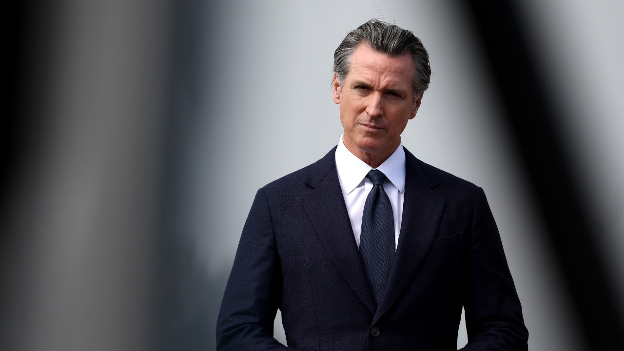
Newson, Dem leaders try to negotiate Prop 47 reform off California ballots, as GOP wants to let voters decide
-
 Politics1 week ago
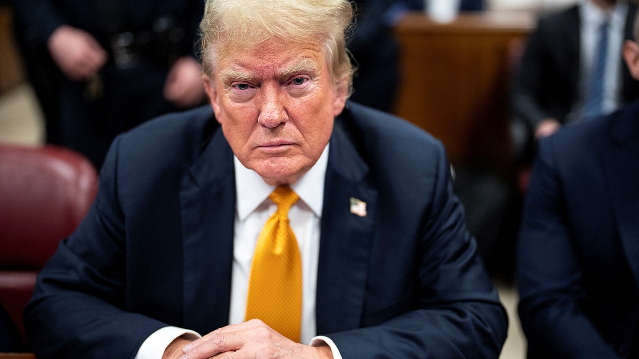
Gun group vows to 'defend' Trump's concealed carry license after conviction
-

 World1 week ago
‘Bloody policies’: Bodies of 11 refugees and migrants recovered off Libya
-
 Politics1 week ago
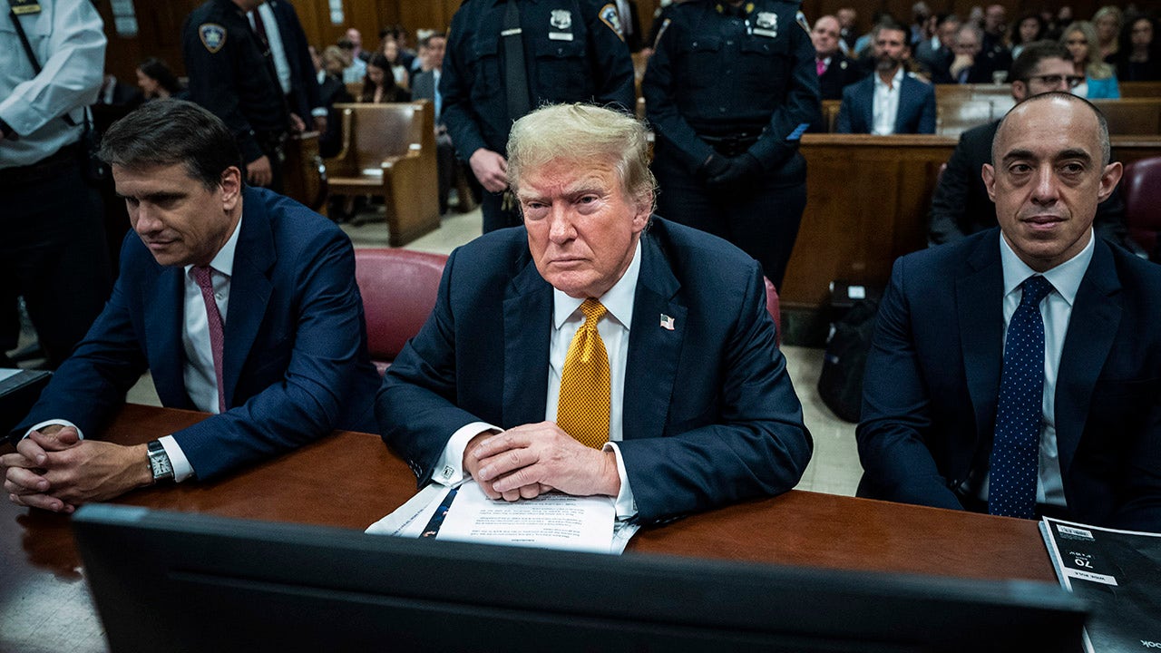
Should Trump have confidence in his lawyers? Legal experts weigh in
-
 Politics7 days ago
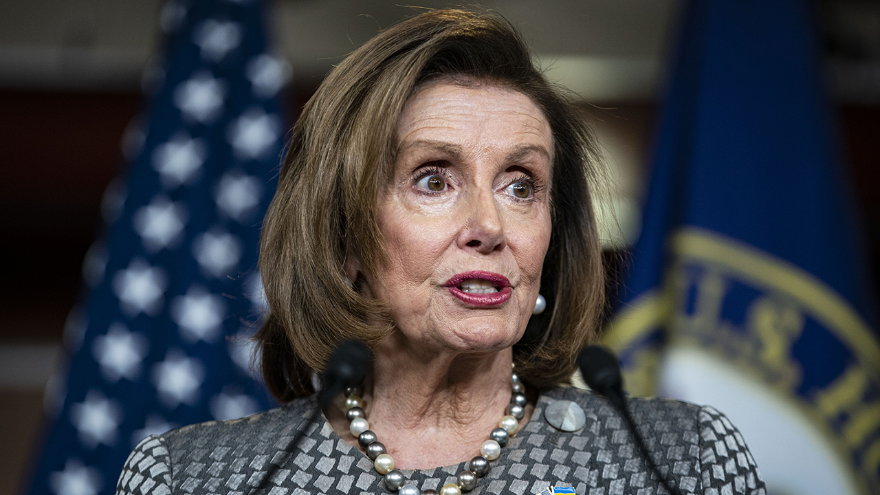
GOP releases Jan. 6 clip of Pelosi saying 'I take responsibility' as she discussed National Guard absence
-
 World1 week ago
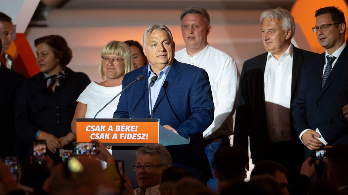
Orban party loses major support in Hungary's EU election
-

 News1 week ago
Trump to escalate blame on trial judge Juan Merchan if sentenced to prison
