Sports
Ranking the Premier League home kits: Dialling codes, Lasagne-gate and Tron


A new Premier League season is nearly here, which means only one thing: it’s time for footballers to stand moodily, staring straight ahead, possibly somewhere with artistic lighting and some extremely jerky camerawork, modelling their team’s new kit for the season.
A relatively new phenomenon has been clubs revealing the new kits to the players and filming their reactions, which virtually all inspire a forced grin and them saying slight variants of, “Yeah, that’s nice, that is.”
Of course, if they hated the shirts, they couldn’t say so… but we can. So here are this season’s new Premier League home kits: ranked.
Getty Images
Sweet fancy Moses. You do sometimes wonder how some things happen, and whether anyone actually genuinely thinks they’re a good idea. Person A suggests an idea they sort of half-believe in, Person B doesn’t really understand it but just says yes to avoid looking stupid, so Person A is emboldened, goes to Person C and says, “Well, Person B thinks it’s a winner”, and then it all snowballs from there.
That’s one of the only explanations I can come up with for this shirt, which really does look like someone has taken a baseball bat to a lava lamp, the result of which splooged all over a perfectly nice blue shirt.
It’s the sort of jersey that would exist if there were football teams in the sci-fi action film Tron. I don’t care for it.

Getty Images
Getty Images
Let’s address the elephant in the room here: this is not a Southampton kit. Sure, it’s got the Southampton logo, and Southampton players will wear it this season in Southampton games, but it’s not a Southampton kit. It’s a Brentford kit from around 2014, or perhaps at a push a Sunderland kit from a few years after that.
But it’s not a Southampton kit. Absolutely no way. And don’t let them fool you into thinking it is. Even if you don’t care about that… it’s just a bit dull, isn’t it?
Last season’s shirt was a glorious slice of retro Hummel, so it’s a double shame that when many more people will be watching them this time, they’ll be wearing whatever nonsense this is.
Getty Images
Getty Images
If you Google ‘Sudu’, the top results are a duel between Wolves’ new kit providers and a Malaysian restaurant in London. Would it be too sniffy to suggest that the chefs at the Queen’s Park-based eatery could have done a better job of designing a football shirt than their namesakes?
The theory is clear: Wolves’ owner Fosun Sports Group has a stake in the newly-formed Sudu, and will thus get a bigger cut of sales, which in turn makes the shirt cheaper for fans (£58 for the replica), but that isn’t much use when ticket prices have just gone up massively.
But we do also go back to the basic fact that this shirt looks like it has been designed by someone who has never designed a football shirt before. Which, to all intents and purposes, is exactly what it is.
Getty Images
Getty Images
It’s always a little disconcerting when a club returns to the Premier League after a long while away wearing a shirt that doesn’t actually look like the sort of shirt that club should be wearing.
With Ipswich, you want some familiarity, which means lots of white on the sleeves, if not completely white sleeves. Not this time: blue with white pinstripes and a darker blue collar. Those of us of a certain age and with a nostalgic bent would also prefer Fisons to still be their sponsor, although given they appear to have gone out of business, admittedly that is a bit of a tough ask.
It’s fine, but if you took the badge off, would you get in five guesses whose shirt this was? Possibly not.
Getty Images
Getty Images
I’m all for consistency in design, having a common theme running through your shirts…but isn’t this basically the same shirt West Ham had last season? And for 2020-21? And 2015-16? And 2011-12?
You get the point. It feels like West Ham have a system where they go for something slightly different for a year or two, then just fall back on this ‘classic’ design, giving a nod to their shirts from the 1960s and ’70s.
Which is not to say this isn’t a nice shirt. Shorn of context, it’s lovely. A great example of how to do clean and simple. But it is a bit rum to ask people to ditch that shirt they paid £75 for a year ago — old news, no longer relevant, get with the programme, grandma — and pay £75 for a new one, when the only change you’ve made is a slightly different collar.
Getty Images
Getty Images
Area codes are big news in football right now. Lamine Yamal was big on the 304 postal code of the town he grew up in during Euro 2024, while City appear to have based their new kit around the Manchester dialling code — 0161, displayed on the collar and cuffs.
It’s the only real detail on an otherwise entirely plain sky-blue shirt, the problem being that the pattern they’ve used makes it extremely difficult to make out the numbers.
From a distance of more than about three yards away, it looks more like a loose attempt at camouflage, but even closer up the 0 looks like a ’u’ and the 6 looks like nothing in particular. So, nice idea, but it does seem a bit pointless when you can’t actually see it.
Getty Images
Bournemouth
Bournemouth were the last of the 20 Premier League teams to release their new kit, spending the interim messing around with some odd shirt designed by their celebrity part-owner Michael B Jordan that they’d only wear in pre-season.
So the question is: was it worth the wait? To which the answer is: sort of! It’s a perfectly decent design, the stripes are strong and the red and black colour combination is always going to be pleasingly bold.
But you are always slightly suspicious when teams who don’t usually have gold on their shirts suddenly throw a bit of gold on there. Why? It all feels a bit ”the football club doth protest too much” — them trying to project the image of glamour and success, when just winning games would do that rather more effectively.
This is available to buy without the awful gambling logo on the front.
Bournemouth
Getty Images
”Extra stripes, extra style”, is how Brighton launched their new kit in July, which as a marketing strategy does feel a bit like those razor companies who just add an extra blade and call it the next great leap in shaving technology.
More stripes is good, right? Because it’s more. And more is better than less. More is good. More! It’s actually a pleasant-enough shirt, with those extra stripes placed down the middle of the existing stripes in some sort of stripe-ception attempt.
Elsewhere, it’s fairly straightforward, with a big chunky collar and big chunky cuffs, next to the slightly unusual sleeve sponsor of the Kissimmee, Florida tourist board.
Getty Images
Getty Images
Adidas seem to have gone for a ‘less is more’ approach across the board with its kits this season, basic designs that have a nod to the company’s template from the mid-2000s.
Which is fine, I guess, but it has led to a bunch of shirts that sort of look the same: Leicester, Fulham, Manchester United and Nottingham Forest are all basically the same design with the colours changed (though there is some different detail on the latter two), which feels like a bit of a swizz.
Maybe it’s unrealistic to expect wildly different designs for each team, but it would be nice to have just a little bit of variation.
Getty Images
Getty Images
The sales spiel for this otherwise fairly plain shirt talks of a ”subtle gradient design on the front and back”, and just in case you weren’t 100 per cent sure what that means, they’re talking about the bits where it makes whoever is wearing the shirt look like they are sweating from the navel up. Otherwise, it’s another cookie-cutter Adidas top but with that ”subtle gradient design”.
We also need to dwell on the other Adidas common design, which is the weird band things on the shorts. They basically make it look like all the players are wearing braces and they’ve let them fall off their shoulders, calling to mind the sexy and moody character in a Victorian drama who is caught in an unguarded moment with his blouson undone and a few inches of chest on display, setting hearts a-flutter.
Getty Images
Getty Images
Back to basics for Fulham this season, after their renegade ”red stripes on one shoulder, white stripes on the other” effort last season. And while it’s very simple, it’s also quite nice, with the caveat that the red flashes up from the hips do make it look a bit like a Bolton shirt from the early 2000s.
It is a little spoiled by the sleeve sponsor, a massive logo of something called WebBeds, which, as you well know, is a B2B accommodation distribution company.
Last season, their logo was rather more unobtrusive, but this time they clearly decided not enough people could see it from the planes flying over Craven Cottage on their way to Heathrow airport a few miles down the road, so now it’s about three times the size of the club badge.
Getty Images
Getty Images
Another from the Adidas template box, but at least this shirt does have an element of team-specific detail to it.
Forest are obviously very big on their two stars, which you can see above the club badge there, commemorating the European Cups they won in 1979 and 1980. The background design to this shirt also reflects this, and it works quite well: subtle enough not to be overpowering, obvious enough that the people who need to notice, will notice.
The whole thing is spoiled slightly by the sponsor’s logo, which at the same time as being for a betting company that is not licensed in the UK, is just a really ugly logo.
Getty Images
Getty Images
Do you have a TV show that you really like, but at the same time you completely agree with all the criticisms of it? The West Wing, for example: it’s smug, the dialogue is nothing like how anyone has ever talked in real life, it presents itself as progressive but is fantastically patronising to women, and there’s no way Toby would have ever leaked those details about the space shuttle. And yet, I love it and occasionally watch episodes when I want something comforting.
Which is a roundabout way of saying that this Palace kit, which looks like the art project of a student who has been encouraged far beyond their talent and needs someone to tell them ‘no’ once in a while, is great.
I recognise that, objectively, it’s a mess. But if I was a Palace fan, I’d have been there outside the club shop at 9am the day it went on sale. I love it. Sue me.
Getty Images
Getty Images
There’s something… I dunno …comforting about this Everton kit. I’m instinctively annoyed they have moved away from having their shirts designed by Hummel, which means no team will sport those glorious chevrons in the Premier League this season.
Despite moving to Castore, a brand that seems more at home making polo shirts for rugby fans, this is really quite good. I can’t really explain exactly why, other than the fact it looks like an interpretation of the kit they wore when winning the FA Cup in 1994-95.
That doesn’t appear to be deliberate, going by the blurb released with it, but as a shirt to wear during their last season at Goodison Park (if all goes to plan), this is very good indeed.
Getty Images
Getty Images
Arsenal have played around with the colours of the three stripes on the shoulder of their shirts ever since returning to Adidas in 2019. They’ve had white on red, blue on red, gold on white and now, in the opinion of your noble kit ranker, the best combination anywhere this season with blue on white.
You need strong contrast, as a rule, and this is most certainly that, a shirt that is a tribute to one they wore in the early 1990s. It’s a little different while still being identifiably an Arsenal kit, and also features just the cannon logo (as opposed to the cannon as one element of a shield) for the first time since 1990.
Very strong, although the Emirates logo does seem weirdly massive this year.
Getty Images
Getty Images
Listen, fair play. Adidas’s emotional return to Newcastle was always going to be catnip to those of us who fondly remember the club’s freewheelin’ 1990s and early 2000s glory days, and it doesn’t disappoint.
Here’s proof that you don’t need to do much with stripes, just ensure they’re not too thick and not too thin, and make some sort of provision on the back so the players’ names and numbers are clear enough, and you’re away.
The black sleeves mean that, of the Adidas kits of yore, this probably most resembles the 2002 shirt, sported by your Alan Shearers, Craig Bellamys and Laurent Roberts.
It’s so nice you can even briefly forget that the main sponsor Sela, with its lovely clean typeface and logo, is an arm of the Saudi Public Investment Fund.
Getty Images
Getty Images
It’s our now annual firm congratulatory handshake to Brentford for continuing their policy of only releasing one new kit per season, a retro move presumably designed to make them stand out among the crowd of teams so perpetually happy to rinse their fans.
They will thus be sporting the same home kit as last season in 2024-25, and while that is a bit of a pity because that one is a bit rubbish, we’ll let them off on this occasion.
Well done, Brentford.
Getty Images
Getty Images
Everyone Villa-related seems pretty happy about life these days. Even selling Moussa Diaby, who was so electrifying in the first half of last season, seems to have been greeted as the shrewd business of a sensible football club.
Everyone was in an even better mood when this kit was released, and rightly so. It’s a delightful thing, Adidas managing to pull off the feat of designing a kit for a team they never have worked with before, while at the same time not making it look weird and out of place.
The shade of blue on the sleeves is lighter than it has been in some previous seasons, which is a canny move because it makes the maroon stripes pop all the more. The pattern on the collar is also a nod, unless I’m much mistaken, to the design worn when Villa won the European Cup in 1982, which is a lovely little touch.
Getty Images
Getty Images
You have to assume this wasn’t at the forefront of Nike’s mind when it designed this shirt, but the solid block dark blue sleeves are an interesting choice for Tottenham, given that for the last competitive game they sported this design, half the team had spent more time in the toilet than on the pitch. That was in 2006, and the match in question was the infamous ‘lasagne’ game against West Ham, when many of their squad had been struck down with food poisoning.
Calamitous gastric reminders aside, this is a really great looking shirt, clean and bold, with the sponsor’s logo in bright red actually adding something to it rather than looking awful (although it could probably do with being a font size or two smaller), while the shorts are dark blue rather than white, which is as it should be.
Yes, yes and yes. Just be careful that everything you eat is cooked through properly.
Getty Images
Getty Images
The trouble with teams wearing their new kits for the last game of the previous season is you forget that’s actually their new kit. Genuinely went searching for a few minutes for Liverpool’s new shirt, because I just assume this wasn’t it, having already seen it in action. Which is more a comment on my declining faculties than the kit itself, which is truly excellent.
It might be slightly tricky to do but while they’re sorting out the financial rules or tweaking VAR to pretend it makes the slightest bit of difference to that dreary blight on the game, the FA or the Premier League should really put a law in place that stipulates Liverpool should always have a splash of gold/yellow on their kits.
There’s just enough here, and in addition the collar is excellent and the broken-up pinstripes thing works. Gold stars to everyone involved.
Getty Images
(Photos: Getty Images/Design: Dan Goldfarb)



Sports
London descends into disorder as Morocco fans flood streets after World Cup elimination by France

NEWYou can now listen to Fox News articles!
Public unrest began in parts of London late Thursday night, and it appears Morocco’s exit from the 2026 FIFA World Cup at the hands of France is the reason.
France took down Morocco 2-0, eliminating the African country for the second consecutive tournament, this time in a quarterfinal match.
As a result, many feared Paris would erupt into riots, especially after the chaos that followed Paris Saint-Germain’s UEFA Champions League victory over Arsenal in May.
Instead, images and videos from Edgware Road in northwest London showed police clashing with large crowds as smoke billowed through the streets and debris littered the roadway.
A police vehicle is parked in a road as people from pro-Palestinian activist groups gather near the Edgware United Synagogue during a demonstration against the “Great Israeli Real Estate Event” organized by real-estate agency My Home in Israel, which markets property in Israeli settlements in the occupied West Bank, in London, Britain, June 14, 2026. (Toby Shepheard)
Riot police, equipped with shields and body armor, tried to contain the crowds as they clashed with people launching fireworks and throwing debris. One video also appeared to show an officer down.
KYLIAN MBAPPÉ, OUSMANE DEMBÉLÉ FIRE FRANCE INTO WORLD CUP SEMIFINALS WITH WIN OVER MOROCCO
It’s unknown what happened to the officer who was down on the asphalt or how he was injured.
Fans waved Moroccan flags in the middle of the streets, which held up traffic. Some even jumped on top of vehicles trying to get through the area.
Moroccan fans in the stands before a FIFA World Cup 2026 quarterfinal match between France and Morocco at Boston Stadium July 9, 2026, in Foxborough, Mass. (Richard Sellers/SportsphotoAllstar)
Similar scenes unfolded after Egypt’s World Cup exit, when Argentina rallied for a controversial 3-2 victory that featured several disputed officiating decisions.
Paris, on the other hand, looked more like a city celebrating than one on the brink of a riot. Supporters of both France and Morocco flooded the streets, slowing traffic in several parts of the city.
One video showed horns blasting from cars with French and Moroccan flags out the windows on the L’avenue des Champs-Élysées in Paris. Supporters on the side of the road, waving their own flags, joined in on the celebration.
France’s Kylian Mbappé scored his eighth goal of this World Cup, which ties him for the most with Argentina’s Lionel Messi. Ousmane Dembélé also scored in the second half for France in the 2-0 win over Morocco.
It’s the third straight semifinal appearance for France, while Morocco still made World Cup history despite the loss. After becoming the first African country to reach the quarterfinals and semifinals in World Cup history in 2022, Morocco added to that by becoming the first-ever African nation to reach more than one quarterfinal.
Moroccan fans react while attending a watch party for the World Cup round of 8 match between France and Morocco in Boston, Massachusetts, on July 9, 2026. (Joseph Prezioso/AFP)
CLICK HERE TO DOWNLOAD THE FOX NEWS APP
Morocco’s exit means there are no more African nations alive in the World Cup. France will be taking on the winner of Spain and Belgium, while England and Norway and Argentina and Switzerland face off in the quarterfinals.
Follow Fox News Digital’s sports coverage on X and subscribe to the Fox News Sports Huddle newsletter.
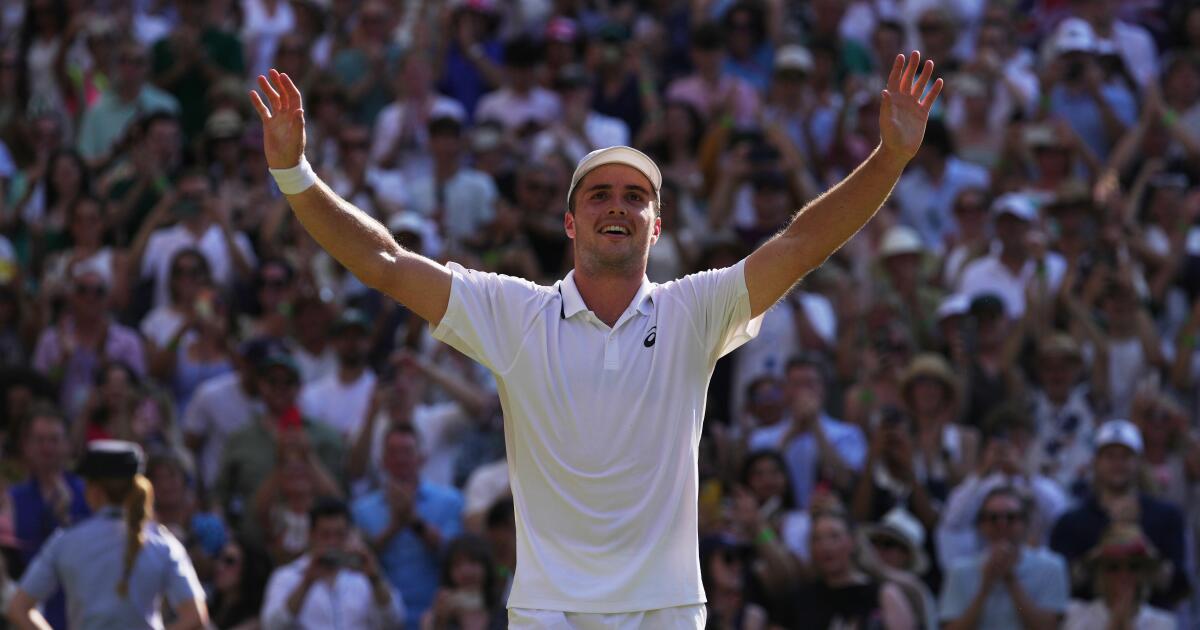
LONDON — A local boy sleeps in his own bed, plays in front of a king and queen and makes a Cinderella run to the Wimbledon semifinals. Sounds like a Hollywood script that might never see the silver screen.
But it’s no fairy tale — it’s Arthur Fery’s out-of-nowhere performance over the last 10 days.
Fery, a virtually unknown British wild card with a triple-digit ranking, has become the emotional heartbeat of Wimbledon while legitimately diverting some national attention from England’s World Cup quest.
The royal treatment at his matches across the All England Club has come in more ways than one.
Fery, who grew up five minutes from Wimbledon and is staying at home during the tournament, first played before grass-court king Roger Federer, Wimbledon’s eight-time singles champion, during Monday’s fourth-round victory. Two days later, he beat No. 9 seed and French Open runner-up Flavio Cobolli of Italy in the quarterfinals 6-4, 7-6 (4), 6-0 in front of Queen Camilla.
Ranked 114th, Fery had never reached the semifinals of an ATP Tour event, let alone a major, before his brief chat with the queen following the match.
“She just said, ‘Congratulations, keep going,’” 23-year-old Fery told reporters later. “I told her it was my birthday on Sunday, so it would be great to play the Wimbledon final on my birthday.”
That’s still a match away. To get there, Fery will have to get past one of the hottest players on tour: No. 2 seed Alexander Zverev, who is fresh off his first Grand Slam title at the French Open. Looming on the other side of the draw is a highly anticipated showdown between defending champion Jannik Sinner against 24-time major winner Novak Djokovic.
If Fery can continue his magical run to the end, he would become the first British wild card to win a Wimbledon title.
Arthur Fery reacts after defeating Flavio Cobolli in the Wimbledon quarterfinals on Wednesday.
(Maja Smiejkowska / Associated Press)
Born in France, Fery’s family moved to Wimbledon when he was an infant. His mother played professional tennis. He was a top British junior but chose to sharpen his game for three years in the U.S. collegiate system at Stanford, as many of his compatriots have done.
“I came out with a lot of hunger coming out of that, and I was ready to attack the pro circuit,” Fery said.
After struggling with bone bruising in his arm that limited him to playing mostly on the lower-tier Challenger circuit in recent years, Fery is finally healthy and playing consistently.
His path to the last four in London has been a masterclass in clutch come-from-behind performances. The Brit has stared down near-certain elimination in multiple matches, repeatedly breaking his opponents’ momentum with Houdini-like on-court acts.
At 5-foot-9, Fery possesses a skill set perfectly suited for low-bounding grass.
His compact strokes, low center of gravity, and elite movement allow him to hug the baseline, take time away from opponents, and confidently execute delicate volleys at the net, according to ESPN analyst Chris Eubanks.
“He defends well,” said Eubanks, a 2023 Wimbledon quarterfinalist. “He can scrap. He can claw. He can dig his way back into points. And when he ventures forward, he’s very, very comfortable at the net. This is a picture-perfect example of someone whose game is built for the surface.”
Still, it’s hard to fathom the multitude of milestones for Fery, who briefly reached the No. 1 ranking in college and earned 2023 Pac-12 Singles Player of the Year honors before leaving early to pursue a pro career.
He arrived at Wimbledon with just one main-draw victory at a major, a losing record as a professional, and only one previous ATP quarterfinal, at Queen’s Club last month. He’s now 11-8, won his first two five-set matches, and is the first British wild card to reach the Wimbledon men’s semifinals in the Open Era. The only other men’s wild-card semifinalist was Goran Ivanisevic, who won the title as a wild card in 2001.
Fery, who started the season ranked No. 185 and will climb to at least No. 36 after the tournament, said there were a “lot of first times” as he reflected on his unprecedented run. “First five-setter, longest match that I’ve ever played, first time breaking into the top 100, first second week in a slam, all at home, five minutes from where I grew up. It’s a great story for me,” he said.
The gap with his fellow semifinalists is understandably massive.
Entering Wimbledon, Djokovic, Sinner and Zverev’s combined records include 29 Grand Slam titles, 2,088 match wins and 155 tour-level titles. Fery was 6-8 in tour-level matches with zero titles.
But he has singlehandedly lifted the tournament for locals. With top hopes Jack Draper and Emma Raducanu withdrawing before the tournament and the rest of Britain’s singles prospects falling one by one — 18 men and women were eliminated by the third round — Fery became the nation’s last knight standing.
If his first name inevitably evokes Arthurian legend, Fery’s march through the draw gave Britain reason to believe again. No sword, no Round Table, just world-class shot-making, a lion’s heart and a Centre Court crowd thrilled to rally behind him.
“This is really quite something to see on home soil,” said Russell Fuller, the BBC’s tennis correspondent, who compared it with Raducanu’s stunning U.S. Open win in 2021 as a qualifier.
Fery earned every bit of it.
In the first round against Damir Dzumhur, Fery dropped the opening set and trailed by a break in the second before surging back. Against Zizou Bergs in the third round, he faced a 4-1 deficit with a double break in the fourth set, and again fell behind 4-1 in the fifth, before somehow surviving.
Then, stepping onto Centre Court for the first time against former top-10 stalwart Grigor Dimitrov of Bulgaria in the fourth round, Fery clawed out of a 2-sets-to-1 hole and a break down in the fourth set to clinch the victory in a fifth-set tiebreak.
“He carries himself with humility, but he’s a fierce competitor, and he’s got a ton of belief in himself,” said Stanford men’s coach and former top-60 player Paul Goldstein, who flew to England Tuesday to see his former charge compete against Cobolli.
While Fery attempts to outmaneuver Zverev on Friday, the other semifinal features a 2025 Wimbledon semifinal rematch between seven-time Wimbledon winner Djokovic and top-ranked Sinner, who defeated the Serb in straight sets on his way to the title. It’s also their second Grand Slam semifinal meeting in 2026. At January’s Australian Open on hard courts, Djokovic bested 24-year-old Sinner in five sets before falling to now-injured Carlos Alcaraz in the Melbourne final.

Arthur Fery hits a return during his Wimbledon quarterfinal win over Flavio Cobolli on Wednesday.
(Clive Brunskill / Getty Images)
Djokovic, 39, enters the match after surviving a grueling five-set, 5-hour-plus quarterfinal slugfest against No. 3 Félix Auger-Aliassime that concluded just minutes before Wimbledon’s 11 p.m. curfew. But the seventh-seeded Serb has a way of defying Father Time and he has had two days to recover on a surface where points are shorter and generally less taxing on the body.
Italy’s Sinner, who defeated Alcaraz in last year’s Wimbledon final, has been efficient if not at the level that saw him capture five consecutive titles before crashing out in the second round at the French Open. After a first-round scare here, the four-time Grand Slam champion has dominated opponents behind his improving serve, winning 80% of his first-serve points. He hasn’t dropped a set since the opening round. Sinner leads the head-to-head with Djokovic 6-5.
According to Eubanks, Djokovic must disrupt Sinner’s movement to break his rhythm, and take his chances.
“He’s got to play similar to how he played in Australia, where it was just all-out aggression,” Eubanks said.
For Sinner, he added: “His serve can be a neutralizing force for what Novak is going to try to do.”
On the other side of the ledger, Fery’s poise under pressure and deft use of the home crowd will be paramount to continue his surprise run against Germany’s Zverev, whom he called a “step up again” from his last five matches. Zverev, 29, is seeking his fifth major final and first at Wimbledon.
“I’m ready for it,” Fery said. “I have nothing to lose. I’m just going to go out there and … put my game on the court, do what I’ve done, believe in myself. We’ll see where that takes me.”
Home has never been closer to Centre Court. Nor has Arthur Fery ever been closer to tennis history.
Sports
Pirates star pitcher makes unfortunate history after being taken out in middle of perfect game bid

NEWYou can now listen to Fox News articles!
Jared Jones was flirting with Major League Baseball history on Wednesday night — he got it, but it was not what he originally envisioned.
The Pittsburgh Pirates pitcher retired the first 18 batters he faced, but he was taken out in the middle of his perfect game bid after six innings.
Now, the Pirates certainly have their reasons — the 24-year-old Jones hasn’t thrown more than 81 pitches in eight starts since returning May 20 after missing all of last season while undergoing ulnar collateral ligament internal brace surgery on May 21, 2025. He was yanked with 77 pitches and likely would have needed more than 100 pitches to record the 25th perfect game in MLB history.
Jared Jones of the Pittsburgh Pirates pitches during the first inning against the Atlanta Braves at PNC Park on July 8, 2026, in Pittsburgh, Pennsylvania. (Photo by Joe Sargent/Getty Images)
However, Jones left the game after getting zero run support, so when the Atlanta Braves tacked on three runs late for a 3-0 victory, Jones instead found himself in the wrong chapter of the history books.
According to Opta Stats, Jones became the first pitcher in the modern era (since 1920) to pitch at least six perfect innings and not record a win.
“It does suck. Something’s cool coming on, but I’m on what? My eighth start off of surgery? I completely understand it, and it is what it is,” Jones told reporters after the game.
Pittsburgh Pirates starting pitcher Jared Jones (17) makes his way to the field to warm up before pitching against the Atlanta Braves at PNC Park. (Charles LeClaire/Imagn Images)
JUSTIN VERLANDER ANNOUNCES HE WILL RETIRE AFTER THIS SEASON: ‘I’VE REALIZED THAT TIME HAS COME’
Jones said he didn’t entertain attempting to complete the perfect game.
“Not with the pitch count,” he said. “Not really ever expecting to go nine right now, so that was never in my head.”
Joey Bart, traded to the Braves from the Pirates on June 18, followed a double by Mike Yastrzemski with a 422-foot, two-run homer to left-center field off a slider from Dennis Santana. Drake Baldwin added an RBI single to center in the ninth for good measure.
It was the second time in less than a week that a pitcher was taken out of the game with a perfect bid through six innings — the Miami Marlins took Eury Perez out after seven innings in which he had 92 pitches. Perez, too, is in the midst of returning from injury and has surprisingly found himself right in the postseason mix.
He was pulled for Lake Bachar to start the eighth, and the Marlins allowed eight runs to the Athletics in the final two innings, but held on to win 9-8.
Jared Jones (17) of the Pittsburgh Pirates delivers a pitch during a MLB game against the Cincinnati Reds on June 27, 2026, at PNC Park in Pittsburgh, Pennsylvania. (Joe Robbins/Icon Sportswire via Getty Images)
CLICK HERE TO DOWNLOAD THE FOX NEWS APP
The Pirates are 4.0 games out of the final wild card spot, which is held by the Marlins.
The Associated Press contributed to this report.
Follow Fox News Digital’s sports coverage on X, and subscribe to the Fox News Sports Huddle newsletter.
-

 Los Angeles, Ca5 minutes ago
O.C. police prep for beach, theme park ‘takeovers’ promoted on social media
-

 Detroit, MI27 minutes ago
Detroit city leaders to DHS: Stop ICE pursuits which endanger the community
-

 San Francisco, CA35 minutes ago
SF Supervisor Jackie Fielder hosts listening session after medical leave
-

 Dallas, TX42 minutes ago
The Stewpot artists find healing, purpose and income through art in Dallas
-

 Miami, FL45 minutes ago
Can Jason Marshall push for a starting spot – The Splash Zone 7/10/26
-

 Boston, MA50 minutes ago
Police investigating shooting in Downtown Crossing – Boston News, Weather, Sports | WHDH 7News
-
 Denver, CO57 minutes ago
Denver mayor announces new $100 million plan to bring in 10,000 jobs
-

 San Diego, CA1 hour ago
WEBTOON Brings Top Creators for San Diego Comic-Con Panels