Lifestyle
Fine Jewelry Designs Exhibit an Urban Flair


Imaginative ways of playing with light have long been one of jewelry’s key features, and several brands recently added a cool urban twist to that technique. Fine jewelry collections have been introduced with graphic looks that clearly were inspired by city architecture and echoed the signature geometry of Art Deco design.
When Chopard unveiled the latest additions to its Ice Cube collection in September, for example, the house’s marketing material described the pieces as “sculpted by light,” with gridlike patterns set onto gold rings, earrings, bracelets and necklaces. Rows of tiny gold cubes, some punctuated with diamonds, evoked an evening cityscape twinkling with lights.
Caroline Scheufele, Chopard’s co-president and artistic director, said she took her cue from Bauhaus architecture and its focus on functionality and simplicity. “This minimalist aesthetic appealed to me through its highly graphic lines that use only the original elements, which are light, shape and resistant materials,” she wrote in an email.
And while geometric jewels have been trending for some time, her pieces appear to reflect a pared-back approach. “Minimalism is expressed as an art of living that involves choosing to safeguard essentials, meaning all that is precious and enduring rather than ephemeral,” she wrote. “Ice Cube jewelry embodies this desire to focus on that which is simple, pure, beautiful and lasting.”
The Ice Cube collection includes a variety of pieces, such as rings, hoop earrings, individual ear cuffs and bangles offered in a range of sizes, allowing the wearer to layer or stack pieces according to taste.
Molly Haylor, the style director at the British edition of Grazia magazine, said the size range reflects the architectural connections of the design trend. “The more adventurous you are with the different ways of stacking, the more exciting it will look and add an element of power to your outfit,” she said. “Because of the shapes and the way they’ve been molded, they all pick up light differently. It does recall the skyscrapers in iconic cities like New York and Chicago or even Tokyo.”
Recent collections at Louis Vuitton and Dior also highlighted graphic looks, notably playing with house design codes.
Louis Vuitton interpreted Damier, the checklike pattern first conceived more than 135 years ago for its trunks and that today adorns products ranging from its ready-to-wear styles to accessories. Now, the motif has found expression in Le Damier de Louis Vuitton fine jewelry collection, featuring diamonds in square settings juxtaposed with polished gold.
The rings are the collection’s most varied pieces, offered in 18-karat white or yellow gold, in different sizes and heights. “When you put them all together they’re like a Lego piece that builds this beautiful structure,” said Ms. Haylor, who added that a graphic, cuff look also could be achieved by stacking Le Damier’s tennis bracelet-inspired bangles.
At Dior, the feminine My Dior collection incorporated the maison’s signature cannage pattern, a lattice look seen on its handbags that is a nod to Christian Dior’s first fashion show. During that event in 1947 at Dior headquarters in Paris, guests sat on Napoleon III chairs with the mesh pattern, which now has made its way to My Dior’s line of rings, earrings and bracelets.
For each piece, the lattice of fine golden strands is created by hand, then a strip of mirror-polished gold is inserted behind the grid to create a play of light between the strands and the strip. (The light is enhanced even more by the diamonds set in some pieces). The collection debuted in September in 18-karat pink gold or white gold, then in late November expanded into yellow gold, with black lacquer for contrast.
Such large heritage houses are not the only ones to adopt the style.
Jessica McCormack’s new Tapestry collection may recall the embroidered friendship bracelets of the 1980s, but the London-based jeweler said she had been inspired by all manner of graphic forms: mosaics, 1920s floor tiles, murals, even the Tetris video game. The result was a blend of pattern and color, with bold patterns such as the chevron created from emeralds and pink and blue sapphires.
Executing the designs was a complex process, however, as each stone had to be set onto a tiny gold tile, then strung together. “It creates this fabric, liquid-like movement,” said Ms. McCormack, adding, “It was a bit of a nightmare. But I do think the best things always are.”
The colors really pop, she noted, thanks to the rhodium treatment that creates an outline around each tile: blackened white and yellow gold for the blue sapphires and emeralds and blackened white and rose gold for the pink sapphires.
The biggest surprise of the collection, Ms. McCormack said, was seeing clients wearing the bracelets alongside their watches, something she attributes to the bangle’s design and its flat clasp. “It sits beautifully with either an Apple watch or Cartier Tank,” she said. “It can work with a watch, which not all bracelets do well.”
Not far from Ms. McCormack’s boutique in the Mayfair district of London is Hirsh, which has unveiled a new line of diamond-set earrings, bangles and rings in architectural eight- or nine-side shapes.
The design took years to perfect, said Sophia Hirsh, the company’s managing director, with time spent considering the form of the designs, their wearability and ergonomics.
Thanks to the various angles, the jewels deliver wonderful reflections of light, she said. “When the light hits the diamonds and you have these slightly different angles, it will always pick up a lot of extra sparkle,” Ms. Hirsh noted. “It’s a little bit more playful to wear. You want to touch it and feel the different angles.”



Lifestyle
Terry Tempest Williams on why women with big ideas get labeled ‘crazy’ : Wild Card with Rachel Martin

A note from Wild Card host Rachel Martin: I met Terry Tempest Williams about 25 years ago at a writer’s conference in Yosemite Valley. I was a young reporter who was there to do a story about how literature was addressing climate change and she made such a huge impression on me. I had never heard someone talk about the natural world the way Terry did and she had a spiritual depth I hadn’t encountered in my life at that point.
To this day, Terry’s writing always reorients me towards what is good, what is beautiful, and what is true. Her newest book is called “The Glorians.”

For its upcoming Los Angeles venue, experiential art firm Meow Wolf will focus on the art of storytelling, with a specific eye toward skewering our city’s moviemaking magic. To help bring that vision to life, Meow Wolf has entered into a creative partnership with Titmouse, one of L.A.’s most renowned independent animation houses.
The Hollywood-based studio behind popular series such as “Big Mouth” and “Star Trek: Lower Decks” will create animation that will be shown throughout the West L.A. venue, which is on target for a late 2026 opening at the Howard Hughes entertainment complex.
It’s a move that represents a shift for Santa Fe, N.M.-based Meow Wolf. Over the last decade-plus, the art collective has grown beyond its anything-goes, punk-meets-psychedelic roots into an organization with full-scale, maximalist installations in its hometown, Denver, Las Vegas, Houston and the Dallas suburbs. In the past, Meow Wolf kept most of its media in-house.
As part of its larger-than-life participatory art installations, Meow Wolf L.A. will feature a mix of live action and animation, the former filmed by Meow Wolf in its Santa Fe studio. Meow Wolf’s James Stephenson, a senior VP with the company and its creative director of emerging media, said the degree to which the L.A. exhibition will lean into various animation styles necessitated an outside partner. Titmouse’s work, in development by a number of directors with contrasting tones, will be shown on a variety of formats, ranging from cinema screens to full-room projections.
“I really believe in animation as an art form, and I know the Titmouse folks do too,” Stephenson says. “Animation is made by artists. It’s made by artists with their own hands. It’s something that is still very rooted in craft.”
Meow Wolf’s L.A. space is set in a former cinema complex, and will champion its location, taking guests on a journey through a converted movie house and beyond, into a sci-fi-inspired fantasyland with sentient spaceships and a 30-foot-tall mushroom tower. Meow Wolf creatives have spoken of the fantastical movie theater as one that will feature animated, self-aware candy before attendees enter the main exhibition space, making Titmouse’s work some of the first art guests will encounter. Titmouse co-founder Chris Prynoski has said the studio has lined up at least six directors for the exhibit.
An in-progress art installation destined for Meow Wolf L.A. at the art collective’s Santa Fe, N.M., headquarters. The L.A. exhibition will feature animation from Titmouse.
(Gabriela Campos / For The Times)
Titmouse, says Stephenson, is the right partner because “they’re known less for a house style, and more for a house vibe.” Over the years, Titmouse has been behind such diverse shows as “Scavengers Reign,” owning a Jean Giraud influence rooted in French and Spanish surrealism, the lively “Jentry Chau vs. the Underworld,” with an unique color palette that took inspiration from anime and Chinese mythology, the exaggerated comic book feel of Adult Swim’s “Metalocalypse,” and the approachable yet expressive tone of “Star Trek: Lower Decks.”
“Meow Wolf’s vibe is similar to Titmouse’s vibe,” Stephenson says. “It’s artist-first, artist-driven, independent and kinda edgy. They are always trying to find the edge of what’s possible. They try to see how far they can go, and it’s done for fun and in the spirit of taking risks.”
Prynoski says working with Meow Wolf will give Titmouse a sense of artistic freedom it doesn’t always have when delivering content for more traditional Hollywood partners. He says the multi-director approach is a callback to the early days of Warner Bros. Animation, when individual creators put their own stamp on Looney Tunes material.
“I use Bugs Bunny as an example,” Prynoski says. “You’ve got a Friz Freleng Bugs Bunny short. You’ve got a Chuck Jones Bugs Bunny short. You’ve got a Tex Avery Bugs Bunny short. They’re all different versions of Bugs Bunny, and people who are really paying attention can tell which director directed each one. Even though to the layman, these are all Bugs Bunny, but if you lined them up, they are drawing in different styles, sensibilities and techniques.”
Prynoski says that was a centerpiece of his pitch to Meow Wolf, noting that characters will reappear in multiple installations, each handled by a different artist. Meow Wolf L.A., in fact, will be the firm’s most character-driven exhibition, as guests will follow the storylines of three main protagonists throughout the space.
In announcing the partnership, Meow Wolf and Titmouse released an image from an animated work directed by Luca Vitale. It features a key character having a moment with a hummingbird and it’s done in an elegant, slightly anime-influenced style. It’s an image full of movement, reflecting a character in transition with inviting pastels and bold dashes.
“I like that image because I think it captures some of the sense of wonder that we want people to feel,” Stephenson says. “The character is having an encounter with the elusive nature of creativity and reality in a way that makes them have a different perspective of what’s possible.”
Other contributing animation directors to Meow Wolf L.A. include Space Dawg, Felix Colgrave, Alexander Vanderplank and Phimémon Martin, and Jun Ioneda.
Titmouse’s partnership with Meow Wolf will extend beyond the L.A. exhibition. The two will be working on the development of Meow Wolf New York, which is slated to open some time after Los Angeles, and are collaborating on a planned animated series, which Prynoski is spearheading.
Meow Wolf exhibits are the result of sometimes hundreds of disparate artists coming together in a shared space. Distilling that into a signature, singular style for a series could be a challenge. Stephenson pinpoints some guiding principles.
“You really need to feel the hand of the artist,” he says. “You need to feel a DIY aesthetic. You need to feel the materiality. Those are very specific to what we are.”

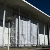
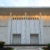
The Kennedy Center on June 28, with its facade signage still covered by a tarp and scaffolding.
Alex Wroblewski/AFP via Getty Images
hide caption
toggle caption
Alex Wroblewski/AFP via Getty Images
On Wednesday, a federal appeals court denied President Trump’s request to stop the removal of his name from Washington, D.C.’s Kennedy Center. The signage on the building has been covered with tarp and scaffolding since June 13, but in a court filing last month, the center’s current executive director said that Trump’s name has been removed.
In their decision, three judges from the U.S. District Court of Appeals for the District of Columbia Circuit said that the president had failed to prove that the arts center would be “irreparably injured” without Trump’s name attached to it.
NPR requested comment from the Kennedy Center, but did not receive an immediate reply.
This latest round of court decisions is part of the ongoing litigation filed by Rep. Joyce Beatty, D-Ohio, against President Trump and the board of the Kennedy Center. In a statement emailed Wednesday to NPR, Beatty said: “Today’s ruling again affirms that this administration’s efforts to rename the Kennedy Center were unlawful. His name no longer desecrates this sacred memorial, which belongs to the American people. Now it is time for the Trump administration to accept this, comply with the law, and take the tarps down.”
In previous court filings, Trump’s legal team had asserted that removing the president’s name from the arts complex, both on the physical building and in its digital materials, would inflict irreparable harm in both time and money already spent. In the denial, the three judges — Patricia Millett, Robert Wilkins and Gregory Katsas — wrote that since Trump’s name has already been removed, “a stay would not avert those harms.”
Furthermore, Trump had claimed that without his name attached, future fundraising would be threatened “and [will] contribute to the financial decline of the Center.” In response, the appeals judges wrote: “Appellants, however, have failed to support this assertion with any specific facts or evidence. They offer only the conclusory assertions of the Kennedy Center’s Executive Director that were made in a factually unsupported declaration.” The center’s current executive director, Matt Floca, specializes in physical plant management.
The presiding judge in the case, Christopher R. Cooper, has ordered that the center provide him a status report on the center’s operation and programming before the end of this month. As of Wednesday, the center’s calendar lists a small roster of programs, including outdoor free movie screenings, workshops for children, and five free live performances in July on its Millennium Stage. In the past, the Kennedy Center presented over 2,000 arts and education events each year, including free daily Millennium Stage performances.

-
 Politics6 minutes ago
Iran ceasefire is ‘over,’ Trump says, and orders additional strikes
-
 Science9 minutes ago
Diarrhea-causing cyclosporiasis exceeds 1,000 cases in U.S. What Californians should know
-
 Sports14 minutes ago
Arthur Fery’s fairy-tale Wimbledon run puts British wild card on brink of history
-

 World24 minutes ago
Burnham on course to become next UK PM with backing of 322 Labour MPs
-

 News51 minutes ago
Trump fires last members of election commission, inciting fears of midterm ‘chaos’
-

 Los Angeles, Ca2 hours ago
California teen e-biker baiting police to chase tracked by drone, arrested
-

 Detroit, MI2 hours ago
Our picks for state\nSenate from Wayne Co. | Endorsements
-

 San Francisco, CA3 hours ago
Man reported missing in San Francisco